Light Is The First Composition
Composition decides where the eye goes. Light decides what the eye is allowed to see, and that decision is made before the frame exists. Four variables carry it, quality, direction, ratio and colour, and brightness is not one of them. Get the order wrong and no amount of grading will recover the shot.
The Decision That Comes Before The Frame
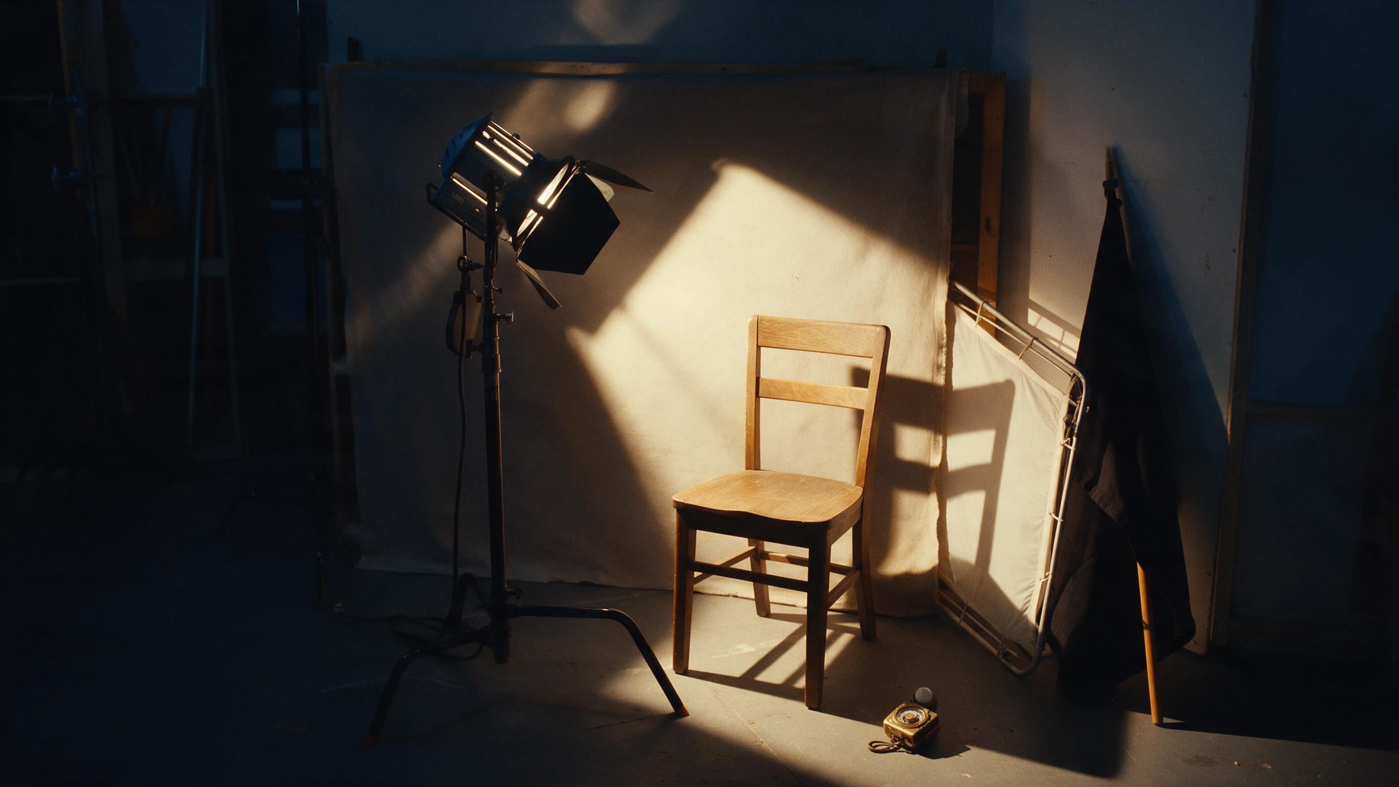
A face can sit perfectly on the third line and still vanish, because the light let it fall into the same value as the wall behind it. That is what makes light the first composition rather than the second. It is settled before framing, and it decides what is visible, what is hidden, and how the audience feels about both.\n\nEvery setup decomposes into three jobs, even when one of them is nothing. A key sits somewhere between 15 and 45 degrees off the camera-subject axis, and it defines the shape and the mood. A fill lifts what the key left dark. A back light separates the subject from the background, and without it the subject melts into whatever is behind. The key is the decision. Everything else is a reaction to it.\n\nThat order is the whole reason lighting comes first. The mood is set by two dials: how hard or soft the source is, and how much shadow is allowed to survive. Framing cannot repair either one. Grading cannot repair either one. They are fixed at the moment the lamp is placed.
Quality Is Geometry, Not Power
Quality is set by the size of the source relative to the subject, not by its brightness. A bare bulb on a stand is a small source, and the shadows it leaves have edges you can cut yourself on. A 60 centimetre softbox held 45 centimetres from a face is a large source, and the same output leaves shadows that feather away with nothing to grab. Move that softbox 6 metres across the room and it turns hard again, without anyone touching the dimmer.\n\nThat is the mechanism, and it survives every budget. Sun at noon is hard because the sun is a small disc 93 million miles away. Overcast sky is soft because the whole sky is the source. A window is soft because it is large and close. A phone screen held near a face is soft for exactly the same reason.\n\nThe working line fits on a card: big light close means soft, small light far means hard. Soften anything by making it bigger, bringing it closer, bouncing it off a wall or pushing it through diffusion. None of that requires a brighter lamp.
Direction Is The Emotion, And It Has Names
Where the key sits relative to the face is the emotion, and the positions have names because the differences are measurable. Straight on the camera axis is flat: texture hidden, drama removed. At roughly 45 degrees to the side, the natural dimensional portrait, with a small triangle of light on the shadow cheek. At 90 degrees, split lighting, half the face lit and half gone, which reads as conflict. From behind, into the lens, a silhouette that withholds the person on purpose. From above, shadow under the nose, glamour and authority. From below, horror.\n\nThe 45 degree position is the default, and it is the default for a reason. It gives a face two values instead of one, which is what makes it read as three-dimensional on a flat screen. Every other position is a deliberate departure from it, taken because the scene needs the departure, not because the light was easier to reach.\n\nNegative fill is the tool nobody bothers to name. A black flag on the shadow side adds no light at all and deepens the shadow anyway, which strips the last of the gloss without touching the exposure. It is the cheapest control in the kit.
The Ratio Is The Mood Dial And The Fill Is The Control
Contrast is measured as a ratio between the key and the fill, and the useful band is wide. Around 2 to 1 is bright, even and low contrast: comedy, optimism, daylight. At 8 to 1 and beyond the shadows go deep and the image turns: drama, noir, thriller, night. The numbers are not a style. They are the difference between a room that feels safe and a room that does not.\n\nThe dial is the fill, not the key. Adding fill softens reality. Taking it away hardens the truth of the frame. Remove the fill entirely and the result is a split face, half of it in shadow, which is a ratio decision made by subtraction.\n\nTwo of the four variables get confused constantly and they are not the same variable. Quality is how the source is shaped. Ratio is how much shadow survives. A shot can be soft and high contrast at the same time, and the frames people remember usually are. Flatness is not softness. They arrive from different decisions.
Light is the first composition.
Motivated Light Is The Lie That Sells The Shot
Light has to appear to come from something in the world: a window, a lamp, the moon, a screen. Audiences forgive almost any lighting choice if it has a source. Unmotivated light reads as studio, and studio reads as fake, however well the frame is exposed.\n\nThe fastest natural route is a window, with the subject near it and nothing artificial switched on. Practicals, meaning lamps visible in frame at around 3200 kelvin, justify warm pools of light and hand the shot depth at the same time. The apparent source does not have to be the real source. It only has to look like it.\n\nThe cardinal error is a moon behind the subject with front light on the body. That is physically impossible and it reads as impossible in a single glance. If the moon is behind her, she is backlit: rim light on the edges, cool and silver, the front of her in shadow. Period. If front light is needed, something else in the frame has to motivate it, and that something else brings its own temperature with it.
Name The Source Out Loud Before The Shot
The motivation gate is mechanical, which is why it survives a busy day. Three questions, answered before anything is shot, and made consistent with each other. What is the source. Where is it relative to the subject. What is its colour temperature. Say all three out loud.\n\nThe temperatures are not interchangeable. Moonlight runs cool, roughly 5500 to 6500 kelvin. Candle and tungsten run warm, roughly 1850 to 3200. Daylight sits near 5600 and reads neutral. Mixing them on purpose is what makes a night interior look expensive: cool blue rim from behind, warm amber key from the front, two temperatures inside one frame instead of one flat wash.\n\nThe worst tell in generated imagery is uniform brightness, because no real room is lit evenly. Always name a direction and a falloff. Half the face in shadow. Subject lit, background falling to darkness. The probability that a frame comes back looking plastic is high exactly when every surface in it returns the same value. So the check is the one that gets skipped: if the key direction contradicts the source position, the shot is wrong, and the fix lives in the prompt, never in the grade.\n\nThe 393-page book published on 8 April 2026 was assembled under the same rule, one decision named out loud at a time, before anything was committed to the page.
Quality is the size of the source, not its output.
The map is dead. Nobody told you.
Bali State of Mind is the survival guide for the collapse of everything you were taught to believe.
Beyond this book
Building the same thing somewhere else.
Julien Uhlig is available for advisory work, board seats and media appearances. Write to media@exventure.co.
The academy that trains the operators, across every company in the group, is EX Epic Academy - 25,000 applications, 25 seats per cohort, 210 alumni across 19 countries. academy.epicsolutiongroup.com
18-20 November. Online, Las Palmas, Bali.
Three days on what happens to work, capital and institutions when the map stops matching the ground. Seats are limited by cohort.
ex-aisummit.com →